What's New in Release 77?
For Release 77, we worked extensively on improving our charting capabilities. As a result, we are very proud to bring you two new types of charts! Some of the highlights in this release include:
- New chart type: Scatter Plot chart
- New chart type: Bubble chart
- Internet Explorer 8 performance boost
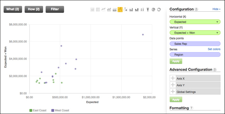
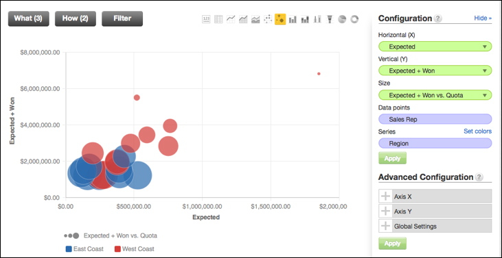
Scatter Plot and Bubble Charts
We are extremely thrilled to bring you these two new chart types which will increase your charting options and also improve overall charting capabilities. The scatter plot and bubble charts enable you to plot two metrics, one on each axis, to see whether a correlation can be determined between them. To start using these charts, click on the new Scatter Chart and Bubble Chart visualization icons on the top right. Then, you can customize your charts by clicking the "Show Configuration" link to the right of the visualization icons.
Notice in the bubble chart below that a third metric can be selected and placed in the "Size" bucket, in chart configuration menu, which will determine the diameter of the bubble.
Internet Explorer 8 performance boost
For our IE 8 users, we've made some significant performance improvements specifically for the legacy browsers. From now on, Reports and Dashboards will render much faster in IE 8.
Stay tuned for more new features coming to GoodData soon!